Interactive Restaurant Menu
This was a 6-week school project at Hyper Island where we were asked to come up with a new and creative way to order food at restaurants. Our group of four UX Designers worked both remotely and in person from Karlskrona, Sweden. The goal was to rethink the dining experience and explore how digital solutions could improve the way people interact with menus and staff inside a restaurant.
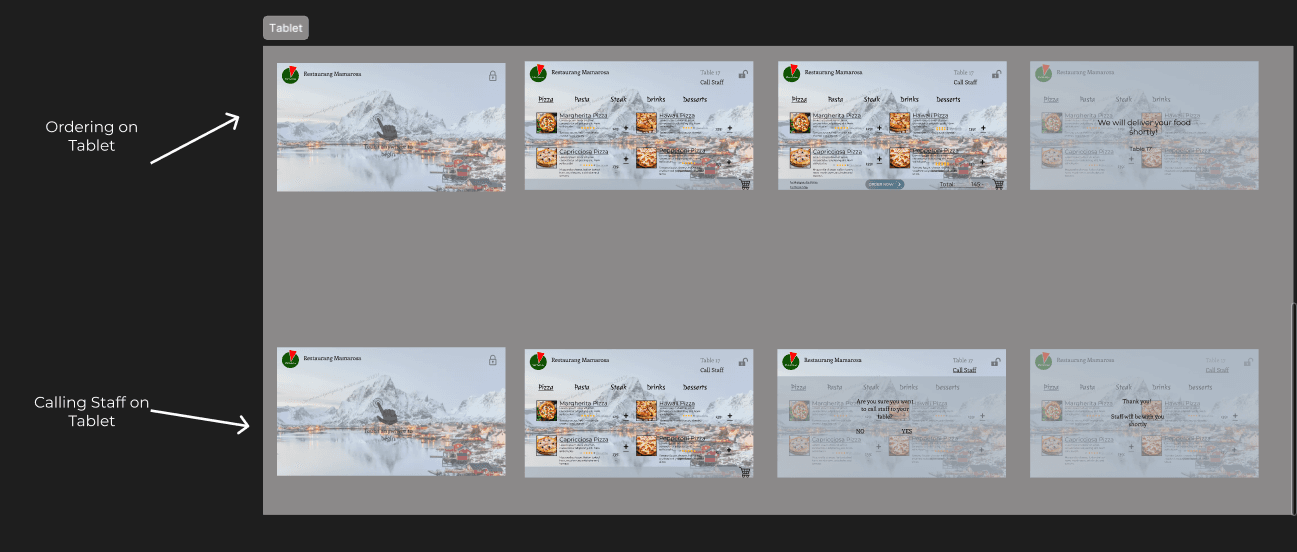
We came up with an idea for a digital menu built directly into each restaurant table using an iPad or screen. This way, customers could view the menu, customize their order, and send it straight to the kitchen — all without waiting for a server.

School Project
Karlskrona, Sweden
6 Weeks
4 UX Designers
Figma, FigJam, Miro, Slack
My Role
I contributed to the research, concept development, and the final design of the interface. I helped with planning interviews, turning sketches into digital prototypes, and worked together with the team using tools like Figma and FigJam. I also brought in some real-world input by talking to my father, who has over 20 years of experience in the restaurant industry.
Research & Insights
We started our research by interviewing my father, who owns a restaurant and has deep knowledge of the industry. His insight gave us a strong foundation and helped us understand how both customers and staff interact with the menu and ordering process.
In addition to that, we reached out to nearby restaurants in Karlskrona and managed to get two online interviews with local owners. They shared valuable feedback about common problems with current menus, such as long wait times and difficulty explaining dishes to non-native speakers or people with dietary restrictions.
To better understand user behavior, we also looked at modern food apps and self-service kiosks used in places like McDonald's and Vapiano. This gave us ideas for how a menu could be interactive but still simple and intuitive.

Process
We kicked off the project by creating low-fidelity sketches to explore different ideas and layouts. This helped us brainstorm freely without worrying too much about visual polish.
Once we had a direction, we moved on to high-fidelity designs in Figma. We used FigJam to plan user flows, define roles in the group, and keep track of our progress. We also used Slack for daily communication and shared updates.
To make sure the concept made sense from a user perspective, we tested our designs informally with classmates, friends, and even some restaurant staff. This gave us honest feedback about things like button size, navigation, and overall clarity.
Conclusion
This project helped me improve my teamwork and communication skills within a UX group setting. It was also one of the first times I worked with a larger design team from start to finish, which taught me the importance of structure and time management in a short, deadline-focused project.
Even though this was just a school assignment, I learned how to take an idea from scratch, support it with real insights, and bring it to life through design and prototyping. It gave me more confidence working with design tools like Figma and FigJam and showed me how important good research is when solving a real-world problem.